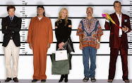
This week's guest was Brooke Shields, and her challenge was for the designers to create a look for her character from Lipstick Jungle (one of the worst TV show titles) that encapsulates a day-to-night look. The day-to-night challenges tend to bore me because the solutions are always uninspired -- take off a jacket and voila, a night look! But I guess a model can't move the scarf from around her neck to around her head while she's on the catwalk... At the beginning, the designers each showed sketches to Shields, who then chose six designs to come into full fruition. Interestingly, Shields chose Keith's design (the worst one) over Leanne's (the best one, which Shields said she would even want in her personal closet).
And then the designers were put into teams.
(Designer, Assistant)
Kato, Joe: (top, far right) Shields told Kato that she liked the color palette (red, green, orange), but then Kato only chose orange after going to the fabric store. I love the jacket because it's bohemia-inspired, which is how Shields described her character, but I hated the flesh-tone tube dress underneath. It wasn't flattering and it hugged too tightly. Unless the dress is black and can hide imperfections, I can't imagine a working woman wearing that dress.
Kelli, Daniel: (bottom, middle) Her final design looked nothing like her sketch. The sketch was a full-on leopard print dress, and the end result only included a leopard print bodice that was extremely ill-fitting. Sadly, Kelli went home, and I think everyone's in disagreement on this. Daniel should've gone home. As Kelli noted, she had already won one challenge and she'd never been in the bottom. Daniel, however, was in the bottom two last week. Plus, the camera showed his poor construction and him repeating "I do high class designs" (and then not creating high class designs) isn't helping.
Blayne, Leanne: (bottom, left) I liked the bermuda shorts well enough, but they were too tight. In order to make it more adult and business appropriate, he should've done looser shorts. Hated, hated the cerulean button up (that was originally tucked in, unbuttoned), but the top underneath was nice enough. It just looked like three separates randomly thrown together by a toddler.

Jerell, Stella: (above)) Who knew this team would work so well together? They created the fan-favorite dress, and it was far superior to the winner's design. Again, his final design looked nothing like his sketch (which involved a camel-colored skirt), but his final design still had great colors, a fantastic hemline (it flowed on the runway), and the mustard leather belt was amazing. The only thing I didn't like was the top. It didn't seem to match the rest of the outfit.
Keith, Kenley: (bottom, right) Worst sketch. Worst team. Worst result. I hated everything about this outfit, from the waistline (right under the breasts?) to the horrific ruffles (looked like they were made of construction paper) to the god-awful print for the top. And his idea for the day-to-night transition? Pulling a string that makes the the sleeves fall. Wow. So ugly. I wouldn't touch this "winning" design with a ten foot pole.
Terri, Joe: (top, far left) My favorite design. It was the most appropriate for the challenge, and Terri wasn't even in the top two teams. The top has a wonderful and sexy neckline that was suitable for work and a nightclub, the paisley print was sophisticated, and yet it was bohemian in essence. She was the only person who made full-length pants, and in a masculinized workforce, that was a smart decision.
Best line of the episode comes from... Jarell, who called his teammate "Stella Barbarella." Not as good as Stella Trashbags (simply because it has "trash" in the name), but still really funny.
And next week, it looks like Blayne gets the ultimate Tim Gunn-down: "It looks like a pterodactyl from a gay Jurassic Park." I'm less excited about next week's drag queen challenge because I don't like over-the-top designs, but eh.


.jpg)


No comments:
Post a Comment