
Here is my Top 10 list:
10. Adaptation: Quite possibly the most brilliant script, this film follows Charlie Kaufman and his fictional twin brother Donald as he attempts to adapt The Orchid Thief, a novel about flowers, without including scenes of violence, drug-use, and sex that are used in most Hollywood films. He wants to write a simple screenplay. Of course, the film's multi-layered narrative is pursued by scenes of violence, drug-use, and sex, but at the heart is a writer who questions the illusion of originality. Here is a wonderful cultural analysis of the film. The movie poster fits thematically with the film, from the uneven courier font (which I obviously love) to the shattered foundation of the orchid. The poster is simple, but highly surreal and symbolic, like the film. I can almost hear Kaufman's ill-advised voiceover discussing the poster...
9. Closer: This film is based on the play of the same name by Patrick Marber, and it was adapted by Mike Nichols for the screen in 2004. This script holds some of the most beautiful observations of human nature (which is often anything but beautiful) I have ever seen, and the film has unforgettable performances by Clive Owen and Natalie Portman. It revolves around two couples who manage to screw each other and screw each other over. It's about how the ideas you have (about yourself, about your lover, about the world) do not necessarily bring you closer to the truth. Certainly, the lies and hurt between the characters do not bring them any closer. The poster is clever in that it focuses on the four main characters, and they literally occupy each other's spaces. The most interesting of which is Portman's Alice, who sits in the background. She is the most elusive character of the bunch - her name isn't really Alice - but she is the most truthful of the group, but the truth is pushed to the back and ignored in order for the characters to rely on the false truths they have created for themselves. The tagline is romantic and hopeless, all at once, and it really speaks to the alternating definitions of love throughout the film.
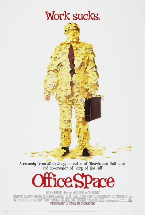
8. Office Space: Who hasn't seen this movie a thousand times on Comedy Central? The poster is a summation of the movie, and the tagline says it all. The reason this poster is clever, rather than just quirky, is that it places a Regular Joe in a blank background. He could be at any job in any city doing any type of work. The only classifiers this character has are his shoes, glasses, briefcase, and tie, which all refer to the materialist structure of society. Harkening back to Marx, what is man? Is man defined by his labor? By what he owns? Here, the character - who most certainly does not share the same body as the protagonist Peter, played by Ron Livingston - is drowned in post-it notes, stripping him of every identifying characteristic of his individuality. Visual sarcasm. I love it.

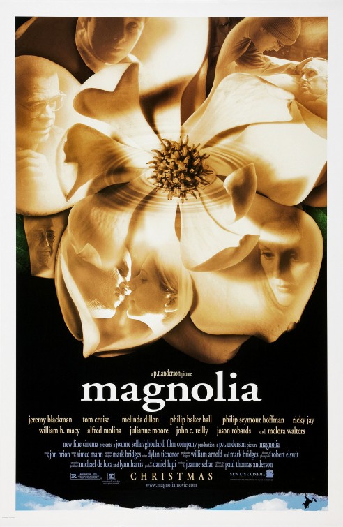
7. Magnolia: I blame this cinematic masterpiece for all of the rip-offs using interweaving character narratives that followed, but this movie is damn near perfect. P.T. Anderson's film is about many themes, many characters, but the one constant throughout the intersecting storylines is the notion of chance, which is discussed in the opening segment. (Not only is coincidence experienced by the characters, but the audience can note references to flowers and Exodus 8:8 throughout the movie.) Click here for a more detailed plot synopsis. The poster is aesthetically pleasing with the characters occupying petals of a magnolia flower. Like the storylines, the petals overlap, and the ripple pouring from the center of the flower further argues the idea that time is relative, that moments repeat themselves, that life sometimes takes you where you dare not go yourself.
6. 300: For a film taken from Frank Miller's graphic novel of the same name, the poster artists were obligated to use an image from Miller himself, not out of homage but because doing otherwise would be sheer idiocy. Even the film stole (appropriated? borrowed?) other silhouettes from the graphic novel. But what makes this poster #6 - and not, say, #10 - is that it illustrates the magnitude of the standoff. It's not just another war movie. It's not just a movie about righteousness (Braveheart) or the importance of family (Gladiator), and it's about more than just honor and duty (like Saving Private Ryan). It's a film about the Spartan way of life (which Frank Miller and the 300 accurately portrayed - minus the awkward Xerxes portrayal), and this poster shows the Spartans on a cliff. To those of us that know our history, we looked at the poster and knew they didn't win the battle, but winning was never the point. The Spartans were about protection, patriotism, and sacrifice, and the poster's tagline refers to the glory of being a Spartan, not of winning.
5. A.I.: Artificial Intelligence: Where to start? I'm not going to lie. I hated this movie the first time I saw it. But upon repeat viewings, it just gets better (and my attention span grows as well). The poster is supreme (might actually be my favorite). Aesthetically, the silver and black balance is striking and clever. The lack of color projects the mechanical themes of the film as well as denying the viewer a vision of the future, which is reserved strictly for the film (probably because this is a teaser poster, but still, the absence of a conceived futuristic society is enticing). The real genius of the poster comes from the cut-out duplication of the boy. It's not enough to say that it's a cut-out; it's a copy... that cleverly produces the letters A and I. David, played by Haley Joel Osment, is a copy. (So which is the real representation of David? The David inside the A, the 'original,' or the David that constitutes the I?) The name of the movie also requires further investigation. Artificial Intelligence refers to robots with mechanically reproduced thought, but it seems that the humans are incapable of loving David. So which is better? To be a human without love, or to be an unnatural robot? As the tagline explains, "His love is real" and his quest for that love is heartbreaking.

4. Atonement: I'll admit that I'm biased towards this film. I loved Ian McEwan's novel, which divides the narrative through three characters (Briony, Cecilia, and Robbie) as well as three physical spaces (the house, the war, and post-war). The movie celebrates the novel by staying true to it, and the film was a true adaptation - taking my imagination and putting it on screen. This poster blew me away when I saw it. It, too, is divided into thirds. The color tones are a beautiful way of separating the zones, and the balance of Cecilia and Robbie's faces is key to their relationship. Of course, those two characters are separated by Briony, who interestingly is put in the same space as the title, again using the courier font, which indicates to anyone who has read the novel that the film is about a writer, and Briony is the one directing the tale ("you can only imagine the truth"). This is her story - quite literally - about the greatest love affair she's ever known, and there she stands walking alone, represented as a child and not as an adult.
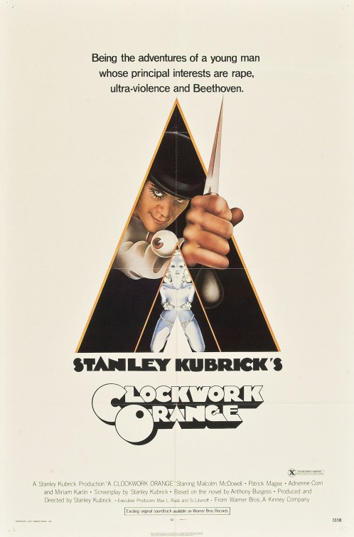
3. A Clockwork Orange: First of all, the tagline is shocking and entertaining. Before you even get a third into the poster, you're intrigued by the character of Alex. Next, you see the unsettling glare of a man possessed by the weapon he carries, and the eye on the sleeve cuff is instantly bizarre, cooking up curiosity in the viewer. Confined to the recognizable V-shape of the frame, Alex hovers above an almost translucent female, representing everything pure, feminine, and futuristic. This poster is certainly interesting because of it's V-shape cropping, which resembles the legs of a woman or a female's reproductive organ (you have a few to choose from). The movie still looks modern, even today, thanks to the vision of director Stanley Kubrick. Ultimately, the film - despite the setting - asks, "Do we lose our humanity if we are deprived of the free-will choice between good and evil?" With this poster, you know you're going to see a visually stunning and innovative film on the human experience.
2. The Lives of Others: Let's see. My favorite film made since I was born. My favorite foreign film. My favorite film about psychological humanity (as opposed to philosophical humanity, which would of course be 2001: A Space Odyssey). This flawless film - I dare you to find a flaw! - follows Wiesler, a Stasi interrogator who spies on a playwright and his actress girlfriend. What follows is the truth of existence, as Wiesler discovers that beauty and art are aspects of the human soul and should not be censored or feared. For the majority of the film, Wiesler is alone in the attic of the playwright's apartment building, and in one moment of unknown happiness, Wiesler holds himself in an embrace. The poster summarizes the film's dramatic themes of deceit, secrecy, and intimacy. Instead of showing one image, the poster shows several, even repeating some images as if in a film reel. The poster alludes to the fact that we, like Wiesler, are voyeurs in this tale, listening in on the most personal of conversations.

1. Vertigo: The most recognizable poster of all time. The movie is arguably Hitchock's best (but it's an easy argument to win), and the bold orange immediately disorients you as the viewer. It slaps you in the face and forces you into the dizzying spiral that leads to the protagonist's demise. At the center of the poster is Scottie and his ideal woman, and her outlined body represents death and simulacra all at once. The death of Madeleine and Judy are represented in the outline like a chalk outline, but it also points to the absence of identity. Madeleine never really existed; she was portrayed by Judy the entire time. But Judy never really existed either because Scottie transformed her into his ideal Madeleine, putting into motion a simulacral relationship. The outline is the ghost of Madeleine - or that Madeleine that was - or that ideal Madeleine. However you choose to interpret it, the outline perfectly embodies the mystery and false reality of the film. There is nothing remotely wrong with this poster.


.jpg)


No comments:
Post a Comment